Using Webspotter, you can see the WordPress usage statistics for free.
Many well-known brands use WordPress because it is very convenient and leaves a lot of space for customization.
Today we look at 10 remarkable corporate websites based on WordPress.
Table of Contents
1. WordPress
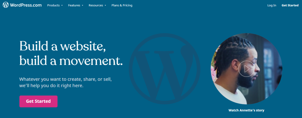
What could be the best confirmation that the product vendor finds its solution useful and valuable? The fact that the vendor uses its own product on a daily basis.
This is exactly the case because the official WordPress website works with WordPress CMS.
The site is made in blue color that is associated with the brand color of WordPress. WordPress website is quite simple (in a good way) in terms of design, and it also contains such multimedia as images and videos.
2. Creative Commons
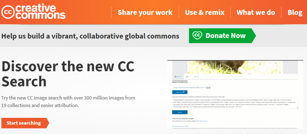
Creative Commons provides internet users with free copyright-licenses.
Their website is made in a bright yellow-orange color scheme, and also contains videos and pictures.
If you go to the bottom of the page, a popup will appear with a description of the company address, email, and other corporate information.
3. New York Post

New York Post is a daily newspaper located in New York City.
The first thing that catches the eye when looking through the New York Post website is that it is divided into blocks, like a real newspaper.
Since this is primarily a news site, at the very top is a news section. Next, come thematic columns (sports, fashion, etc.) and sections with columnists’ opinions.
Regarding the design, the site is made in such a way so that the colors do not interfere with the clear display of text, which makes it very easy to read.
4. The White House

The official site of the President of the United States is made mainly in a white color scheme.
It contains information about events in which the President of America takes part, about the history of The White House. Also, on the site, visitors can see the latest posts from the official White House Twitter account.
5. Business Insider

Another news website on our list, the Business Insider site, is also designed so as not to disturb the visitor from reading the text of the news. Therefore, it contains mostly black and white color palette, which makes the text visible.
Unlike the New York Post site, it does not contain separate news blocks that pop up to the right and left of the page as you scroll through the page.
The site is more like a long news feed that contains large headers related to a variety of topics.
6. Bloomberg Professional Services

Bloomberg is a financial and information news as well as professional software global provider.
The page with which the company offers its services and products has a minimalistic design based on black color.
The page contains supporting videos and images, descriptions of services and products of the company, and does not distract the reader’s attention with bright colors or unnecessary information.
At the top of the page are information blocks, divided into specific categories.
7. Sony Music
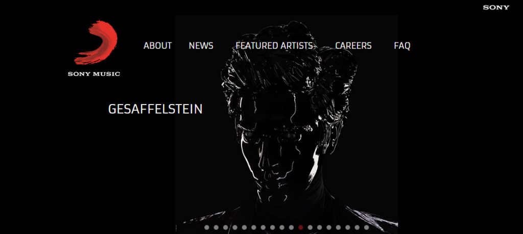
Sony Music is a US-based global music label and conglomerate.
At the top of the page, you can see a list of artists who have contracts with the label. Below there is a section with music videos, and lower there are news related to the company (announcements, music releases, etc.).
All blocks of the site are logically separated, and dark text is clearly visible on a light background, so the information is very easy to perceive.
8. AMC

AMC is a US-based media network and television channel known for such series as Breaking Bad, Mad Men, and The Walking Dead.
The main page of the site contains news and images related to the series. The design of the site is very colorful, but at the same time, it doesn’t create a feeling of being oversaturated with colors and pictures.
9. TechCrunch

TechCrunch is an American online media with a focus on the tech sphere.
The main page of the site is a news feed with the latest events in the technology industry. On the left side of the page, you can choose the news section you are interested in (startups, events, etc.)
The site is made mostly in white color, interspersed with green color, which makes the text very easy to read.
10. Mercedes-Benz
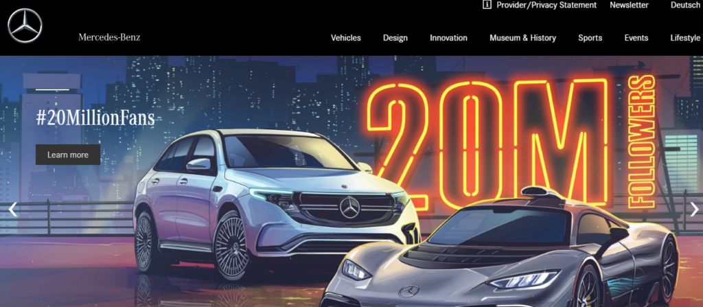
Mercedes-Benz is a German international automobile manufacturer and a marque.
The site contains descriptions of the events related to the brand’s cars, the cars descriptions, interviews with famous people in the automobile business sphere, and so on.
It is noteworthy that the site pages are very pleasant to scroll. The pages are scrolling down not too fast or too slow, but just how you want them to scroll.
The site is made mostly in black, which makes it look stylish and classic.
Wrapup
As you can see, many famous brands prefer to use WordPress in their work. The fact is that this CMS is very easy to use and has many built-in themes that may suit every business. If you want to find more data on which sites use WordPress, try Webspotter, a lead generation and data intelligence tool.
Another useful tool for detecting themes and plugins any website uses – WordPress plugin detector (check out WPblazer’s article on how to download and use it). Both of tools offer a trial version, so you can check it right now for free.

