In this digital age, businesses must keep up with the times and invest in having a website made to promote their products and services. The primary advantage of an official site is that you can provide first-hand information on your merchandise to customers.
Another benefit that a website brings to your business is visibility. Your domain serves as your digital address in the vast world of the Internet. With the right search engine optimization tactics, you can reach your target audience no matter where they are physically located.
Optimizing recruitment website design is vital for attracting top talent. Through user-friendly interfaces and visually appealing layouts, organizations can effectively showcase their culture, values, and career opportunities, enhancing the hiring process.

If you’re developing your business website, here are the important things you should remember when planning its design:
Table of Contents
1. Optimize Key Areas with Relevant Keywords
It’s common knowledge that you should sprinkle in words associated with your brand on your blog posts, particularly in the title, meta description, and content. Keywords are used by customers to search for products, services, tutorials, and reviews online.
For instance, if your company sells ladies’ clothes and footwear, relevant keywords for your website would be “ladies blouses,” “ladies pants,” “ladies lingerie.” You can even make it more specific through long-tail keywords, such as “ladies shoes with heels.”
You can also add your location to ensure that your site pops up for relevant queries from people in your area. Meanwhile, your brand name is also an appropriate keyword, which is why you need to place it on all pages of your website.
These are other strategic areas where you should place relevant keywords:
- Home Page – When people search for your brand on search engines, your link will direct them to this page. It should contain words associated with your brand to ensure that the customers understand what you’re trying to sell.
- Slider – The slider is a moving banner that’s usually placed above the fold, which is at the top of the page. This is the ideal place to put seasonal keywords for promos and such.
- Sidebar – This area typically contains archives or the latest posts. The titles of your articles should include relevant keywords.
- Footer – Your footer design must provide information on your business. It’s also for navigational purposes, which is why it includes shortcuts to other parts of your domain.
2. Lessen Visual Clutter with White Space
Some companies bombard web visitors with information in the hopes of increasing engagement or sales. However, visual clutter will only put off your customers and make them abandon your site.
Allow for the appropriate amount of white space on your website. These blank areas may seem useless, but they send break signals to the brain, which allow people to process the information that they read.
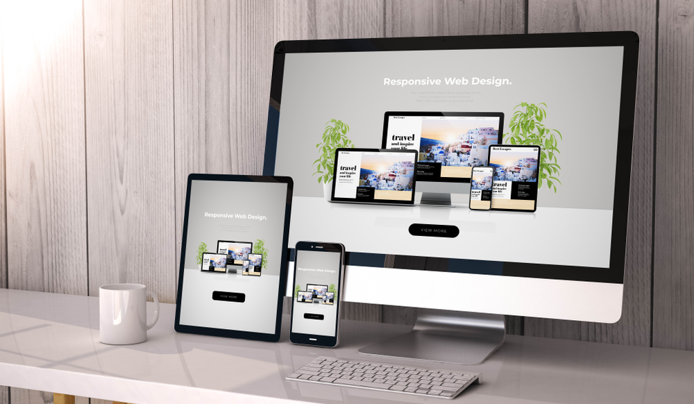
3. Use a Responsive Design
Responsive design is a web development approach that enhances the mobile-friendliness of your website. It stemmed from a need to cater to the preference of today’s consumers.
Most people browse and search for stuff on their phones. Online shopping has also boomed in popularity, with a significant portion of customers purchasing products through apps.
Again, businesses must keep up with the times and understand the buying habits of their target audience. If most of your clients are teens and young adults, you should ensure that you use responsive design when developing your website.
4. Make Navigation Intuitive
There’s a reason why most websites look the same. Most sites have the home, about, and contact pages as well as the blog portion.
In each of these areas, there’s the header that displays the navigation menu, which contains the links to other parts of the domain. You can also find the sidebar and the footer in every one of these pages.
Site structure is crucial when planning the design of your website. You have to map out each of the pages that you want to have for your domain. With this, you ensure that Google and your web visitors are directed to the right content when they click on a particular link.
5. Compress Web Elements
Page speed is another vital element that you should think about when designing your website. Users nowadays want instant results. They want to view your site immediately after clicking on your link.
Ride their interest by ensuring that you compress web elements, such as images and videos, to make your website load up quickly. You can also take advantage of caching, which temporarily saves web files to make it easier to retrieve once the user revisits your site.
Conclusion
A website is a valuable tool for your business. It allows you to reach your target audience no matter where they are in the world.
When designing one for your brand, you should ensure that you optimize strategic areas with relevant keywords, add white space, use responsive design, make navigation intuitive, and compress web elements to cater to the demands of your site visitors.

