Beancruncher.com was an online accounting software aiming to give its customers the most flexibility in the crowded cloud book-keeping business. It promised an impressive set of features but the execution sadly could use some improvement.
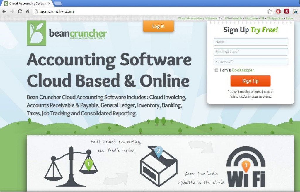
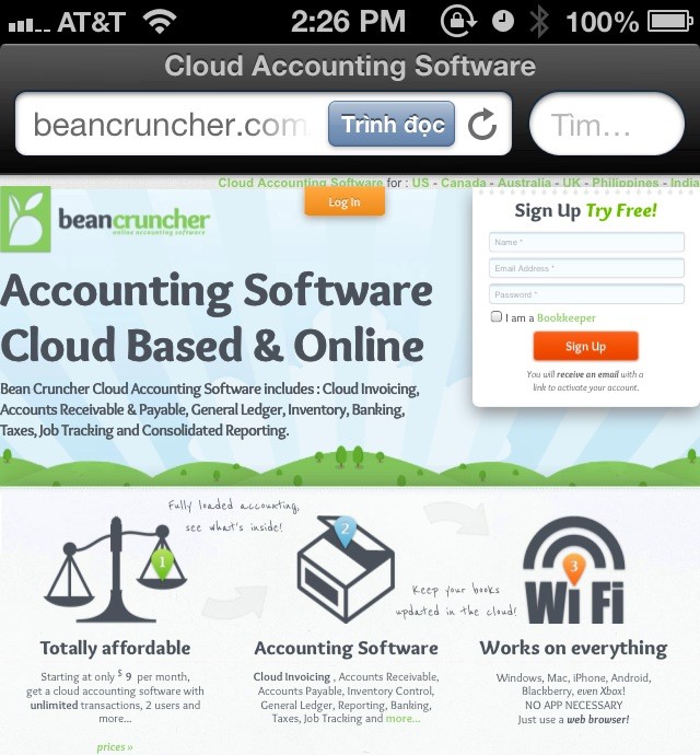
Accessibility was the first area where the flexibility of beancruncher.com shined. Customers could access beancruncher.com on any devices that had a web browser, whether it was a mac, a PC, an Xbox, an android phone, or an iPhone, etc… There was no need to download an app on each device and later on to have to keep such app updated. The user would also be familiar with the layout whichever devices they happened to be on. The screenshots below were from a desktop and an iPhone web browsers.
BeanCruncher also promised scalability and its pricing scheme reflected this. While its competitors charged monthly or yearly fee and gave away the features of managing multiple books in one account, BeanCruncher’s pricing was based on the number of users and the companies included in one account. The prices would be considered low to mid-range, comparable to other services offered online, but there was no free option available.
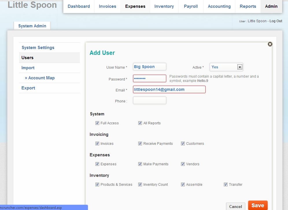
New users and companies could be added easily. They could be made active or idle, and users could also have limited or full access.
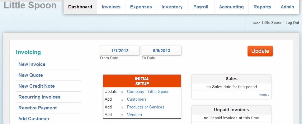
To start out, instead of being offered a website tour in the form of slideshows or videos, new user was greeted with the dashboard view with a big red box in the center, asking them for further information for initial setup. The usual suspects were included here: contact information for customers and vendors, company profile information, and product or services offered.
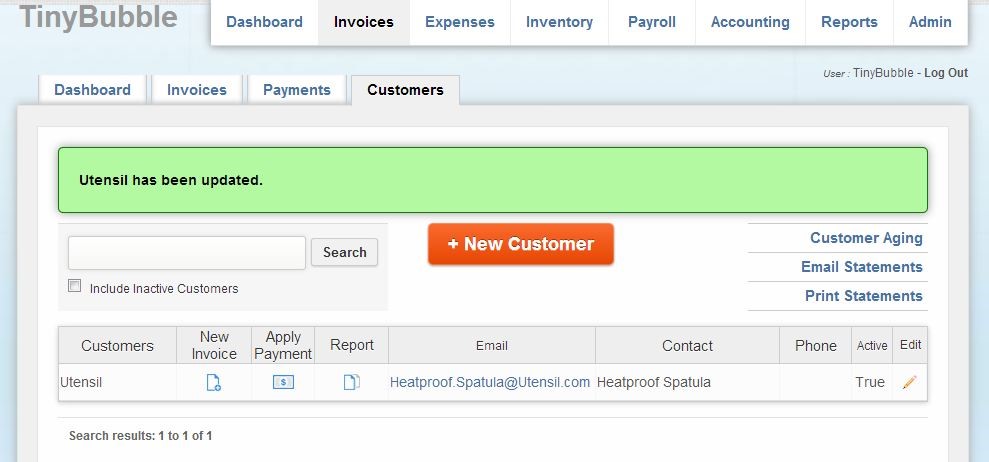
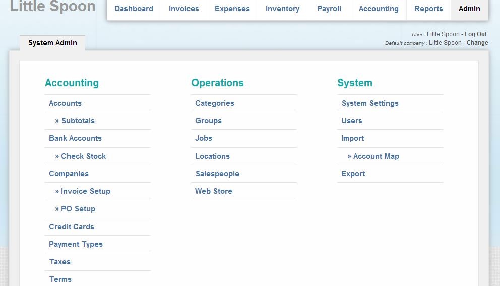
However, once user clicked through to one of those pages to add the information, they could only see the button to add individual contact. The bulk import function was actually buried under the “Admin” tab. I thought the website lacked the bulk import and export features altogether until I found them by accident while I was looking to see for something else. I thought that was an unfortunate design decision.
On beancruncher.com, book-keeping functions were split into five groups: invoices, expenses, inventory, payroll, and accounting.
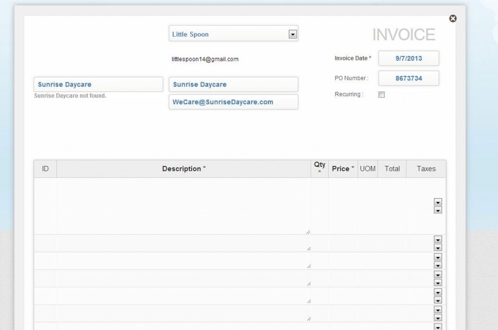
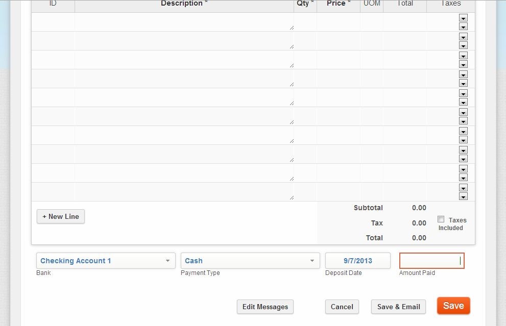
Invoices featured a list of customers, the ability to issue invoices, recurring invoices, quotes, and the ability to keep track of payments, and link payments to invoices. The Invoices dashboard had a graph that I assumed would show the cash flows once there were more data on file. I added one payment but it was not reflected on the graph. I also started to add a new invoice but gave up after several attempts. I filled out the ID and Description, and then as soon as I clicked on quantity, the text in ID and Description would disappear. Sometimes, I would be lucky enough to be able to complete one full line. The line then would disappear as soon as I scrolled down to add the “Amount Paid” box. I was also not a fan of the ten pre-added lines because the invoice form was too long to fit on one page on my laptop screen. So I could not tell you whether other invoicing functions worked because I could not create any invoice as an example. There were two more design choices that I also did not like: the floating design for filling out the invoice as you can see in the screenshots and that the options to import customer contacts, to set up invoices, and to export the list of invoices were not on the Invoices section but buried in the Admin page.
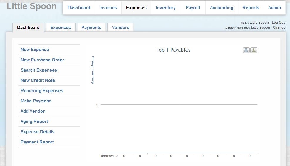
The Expenses section was designed similar to the Invoices and suffered the same design flaws as I mentioned. It had a list of vendors, the ability to create purchase order, expense invoice, and payments. An expense invoice was required before a payment could be made, which I found to be arbitrary.
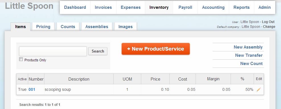
Inventory was a unique section from beancruncher.com that I had not encountered on other bookkeeping services. It had five tabs for Items, Pricing, Counts, Assemblies, and Images. Once again, I could add individual products and services with their pricing. Otherwise, I would have to go to Admin/Import once again, to import a list of products and services, or a report of type “Inventory Balances”. Since there was no sample provided, I was not sure how these reports would look.
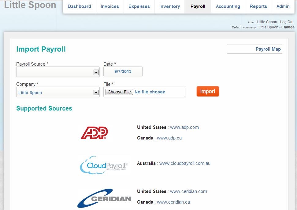
There was not much to the Payroll section. It required to import a payroll report from ADP, CloudPayroll, or Ceridian, which I did not have readily available and also offered to do “Payroll Map”.
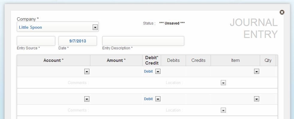
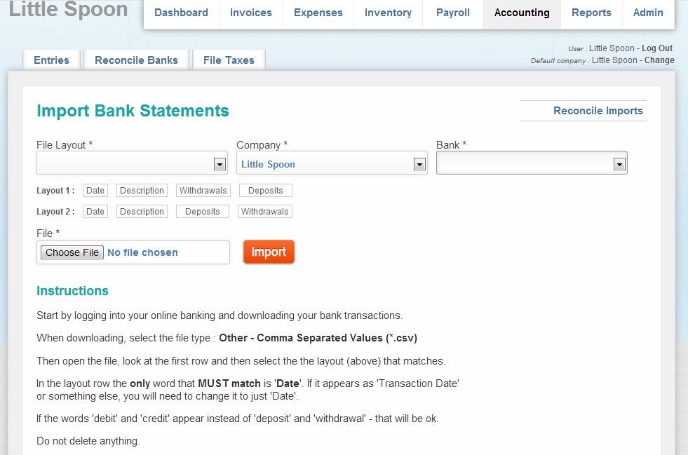
The Accounting section featured a journal entry page, a page to import bank statements, and a tax filing page. The journal reminded me of the balancing book that banks gave away for people to balance their accounts from the past. It was frustrating that there was no mention of users having to add the credit cards and banks account from the Admin page before the drop down menu could work here.
The Reconcile Banks tab was the only page in the entire website that instructions on what to do were included. However, it still failed to mention that the drop-down menu for banks only contained the accounts that had been added via the Admin page.
There was even a bug on the File Taxes page. As shown in the screen shot below, users were required to choose three pieces of information, a company, a date, and a “Tax”. However, there was no menu to choose “Tax” from.
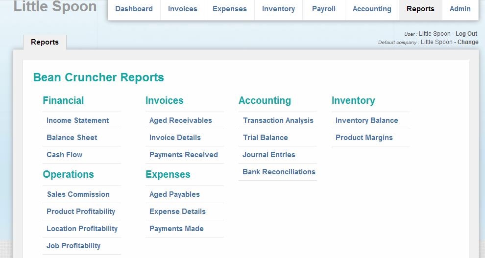
The Reports section shows an impressive list of reports that could be generated. Once the report was generated, the only option to save it was to print it out. There was no export function to save the report as a pdf or an excel file.
Last but not least is the Admin page which had been designed to store all the import and export functions from all the other sections. There were also options such as jobs, sale people, web store that left me puzzling for their relevance in a book-keeping service.
In conclusion, while beancruncher.com started out very promising with creative approach to access and pricing, I was very disappointed as I tried to navigate the website.
Have you tried BeanCruncher? What did you like about it? What didn’t you like?
