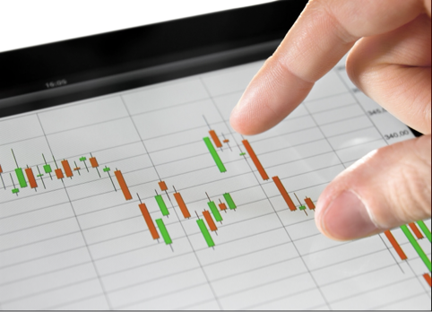
Forex charts come in all shapes and sizes. There’s the line chart, for example, which is often used by beginners due to it being relatively simple for newbies to get their heads around. And there’s also the candlestick chart, which has a higher barrier to entry due to its difficulty levels – but which, in turn, can potentially provide a better level of insight. After that, there’s a whole world of more insight from which you can benefit.
Depending on how experienced you are in the foreign exchange world, it’s unlikely you’ve come across all these charts given that they’re all so diverse and offer different things. In fact, if you’re a newbie, then you might not have come across them at all – and now might be the time to learn. This blog post will share some of the most important types of forex charts and look at some of the skills involved in reading them.
Table of Contents
Line chart
A good place to start when investigating the world of forex trading charts is the line chart. Line charts are the least complicated of the main varieties, not least because they’re recognizable to anybody who has studied basic math. As the name suggests, line charts express their meaning through a line – which leads to the price point at which the currency pair closed.
Bar chart
The main difference between a bar chart and a line chart, on the other hand, is that the bar chart also indicates the opening price of the currency pair rather than just the closing price – so, in that sense, it’s more dynamic. This gives traders a more holistic view of how the currency pair is performing; it allows them to see the high points as well as the low points of both the open price and the closing price. It gives them more of a sense of change than the line chart does – although it’s also fair to say that it takes a bit more study to work out.
Candlestick chart
One of the most famous examples of a forex chart is the candlestick chart. These, as the name suggests, resemble a candlestick, and offer a chance to see the highest and lowest opening and closing points while also offering flexibility on timeframe. This means traders can see a day’s worth of data, a week’s worth, or even just a minute’s worth. While candlestick charts are a famous variety of forex charts, they’re also not the simplest. It takes some time to work out what they mean and are not for beginners.
More unusual varieties
If you’re an experienced trader, meanwhile, it’s not uncommon to opt for other types of forex charts that are more complex. To some degree, it’s down to your broker as to what sorts of charts you’ll get: some brokers only offer certain types of charts, for example. It’s worth heading to a well-known site like The Bull to read some broker reviews and to get the low down on which provider offers what in the forex markets. It’s also down to your skill level: most traders – quite wisely – don’t wish to use charts that they don’t fully understand.
One example of this is the Renko chart, which comes from Japan, and that is similar in some ways to a candlestick chart. It’s put together using what is described as “bricks”, and each brick has a particular and specific significance to that form of charting in terms of the number of pips it denotes, for example, or the direction of travel.
Another example of a more complex chart might be the “point and figure” system, which is confusing precisely because it doesn’t consider the significance of time. It’s advisable that these complicated charts are only used by those who feel confident in understanding and managing their meaning – and that can take lots of time to practice.
In short, it’s vital for any foreign exchange trader – and especially new traders – to make sure that they are on top of the different types of foreign exchange charts that exist. Whether it’s the bar chart, candlestick chart or something else, it’s important to know how to read the various types of forex charts out there – and to be able to make an informed decision about which ones will give you the insights you need when placing a trade.


