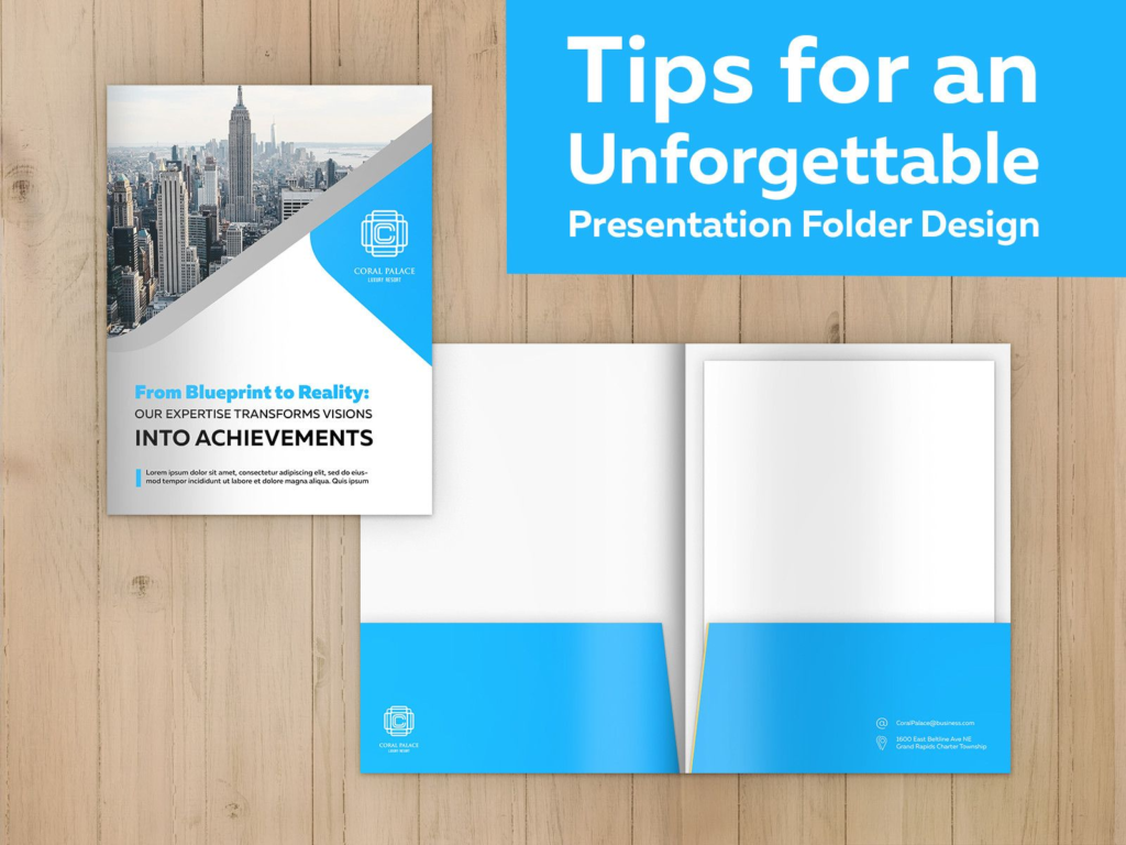
The issue over a ‘good presentation folder design’ versus a ‘bad presentation folder design’ is one of those mildly polarizing dramas that not everyone seems to agree on. These folders fall into a unique category here, as business owners and entrepreneurs want a product that’s personalized without simultaneously appearing tacky, or over the top. Thankfully, it’s easier now than ever to tip the hand on your brand’s personality. You already have the tools; a good instinct for spatial orientation, color coordination, and quality detection is something most people innately possess.
Table of Contents
Why Is a Well-designed Presentation Folder So Important?
You wouldn’t think twice about a merely average presentation folder. After a conference or meeting, you will have forgotten about an uninspiring folder, its lackluster design, and perhaps most importantly, its call-to-action—the heart of any product.
However, a good folder design announces your seriousness, establishing you as someone with aspirations and good taste. But it’s not just a matter of show: The act of incorporating different elements—colors, slits, and other features—into a cohesive design, balancing them to reflect your branding and overall company story is perhaps the best test of those elements. It either exposes them as poor choices for your desired brand image or confirms their fit.
5 Presentation Folder Ideas: the Basics to Consider
Generally speaking, there aren’t any set design elements every good folder has. Rather, there are several that come together forming a balanced and functional aesthetic. If you’re just getting started, this might all seem a bit daunting. That’s why part of your journey should include sifting through a presentation folder design gallery, like the one found on CompanyFolders.com, which inspired many of the tips you’re about to see.
Take Stock of Your Choices
You could design a stellar folder layout, choose a die-cut pattern that promotes user handling, and rush off to the print room in an excited hurry—but if you’ve picked the wrong paper stock, in many cases, no amount of design elements will make a difference. A quality stock is the backbone of your presentation folder, giving it the strength necessary to hold heavier presentation materials and fight through the postal service during transit. In these cases, a thicker paper will do. But other times, a laminated finish might make more sense, especially in cases when your folder is being handled in less than balmy conditions.
The Deal with Laminates
While laminates are firmly in the ‘nice to have’ category when designing a folder, if you’re exposed to rain and dirt, you might consider elevating them to ‘must-have.’ Most laminated finishes are anti-spill and stain averse, making them excellent design features for this simple reason. But equally important is understanding how often you’ll use your folder, and for what purpose. Try asking yourself, ‘will the folder be used every day, or is it a one-time presentation piece?’ Durable laminates like gloss or matte are suitable for long-term use, while soft-touch might be more appropriate for high-impact, short-term presentations.
Think Outside the Box (or Polygon…)
While shapes like squares are predictable, structurally sound, and make the everyday act of inserting square-shaped paper into sleeves generally more practical, it doesn’t mean you should give up on experimenting with other folder shapes. Custom designs are built into the folder production DNA. If you consider how printed products are folded, they start out flat, undergo scoring, and bend into the shape they’re meant to be—naturally allowing for some unique layouts.
What Are Some Common Types of Folds?
- Bi-Fold (Standard Presentation Folder): Most companies print this as their standard folder, no frills required; it involves a single fold in the center, creating a front and back cover with a spine in between.
- Tri-Fold:This version has two folds, dividing the sheet into three panels. It’s less common for presentation folders but is par for the course with folders like brochures.
- Gate-Fold: A more unique style, where two side panels fold inward to meet in the middle, leaving quite the dramatic opening effect.
Break Free from Traditional with a Custom Die-cut
What place do traditional folder cuts have in crafting a memorable folder design? Quite a bit, but with so many folders following the same format, it pays to stand out from the crowd. Die-cuts transform a standard presentation folder in several ways:
- Through strategically cut windows that grant peeks into the folder’s contents
- By subtly trimming the edges into rounded corners, preventing them from dog earring (bending at the tips)
- Or with angled pockets or slots, meant to hold things like brochures or business cards, can create stylish compartments that double as smart storage
These are some garden-variety ways of die-cutting your folder, but they only scrape the surface of the various possibilities offered. The only limitation, really, is your imagination.
Embrace a Full-spectrum Color Palette
According to Vincent Van Gogh, ‘color in a picture is like enthusiasm in life.’ You can take the artist out of the equation—replace him with custom folder designs and color balance—and the point largely holds. Color design has as much to do with psychology as with filling in white spaces. That’s why earthy tones like brown and tan make some people feel warm and secure, while chrome and silver often conjure images of sanitized equipment and steel tables, imparting a cold or detached feel.
It’s not to say some colors are inferior to others; chrome absolutely could work for a futuristic tech company by appealing to intelligent, forward-thinking consumers, not so much their warm and cuddly feelings. Like good music or a tasty meal, a rich color palette can conjure all manner of senses, from texture to temperature, bringing us into the real world.
Emboss or Deboss for Some Visual Flair
Let’s say you went for that thicker, high-quality paper stock. A very possible next step could be to emboss or deboss your brand’s logo, as a stock like this will support a raised or indented impression without tearing or distorting. In short, here’s how the two features work:
Embossing: As embossing plates clamp down on folder stock, the sandwich effect praises the paper and leaves an ‘impressed’ image or design that looks three-dimensional. Combining sight and touch, this multi-sensory interaction increases emotional engagement with a folder from those handling it or viewing it from a certain angle.
Debossing: This aesthetic indents paper stock instead of raising it. The opposite of embossing, debossing abides by the laws of visual subtlety: they are infrequently the sole focus of a design by virtue of their indented nature, are often well-blended with other flashier design elements, and are naturally sleek and resist smudging as, unlike glossy surfaces that can attract smudges, their recessed grooves help maintain a cleaner look over time.
Embossed or debossed elements can set the folder apart from standard flat folder designs, something that’s particularly useful in competitive settings like trade shows or client presentations where your folder will be among a line up of many.
Now, Actually Print the Folder
Once your folder design elements are harmonized, fitted on the right stock and maximized to serve your specific situation, you can submit your specs to your local printing service, confident that it will excel in its life as a personal branding tool.


