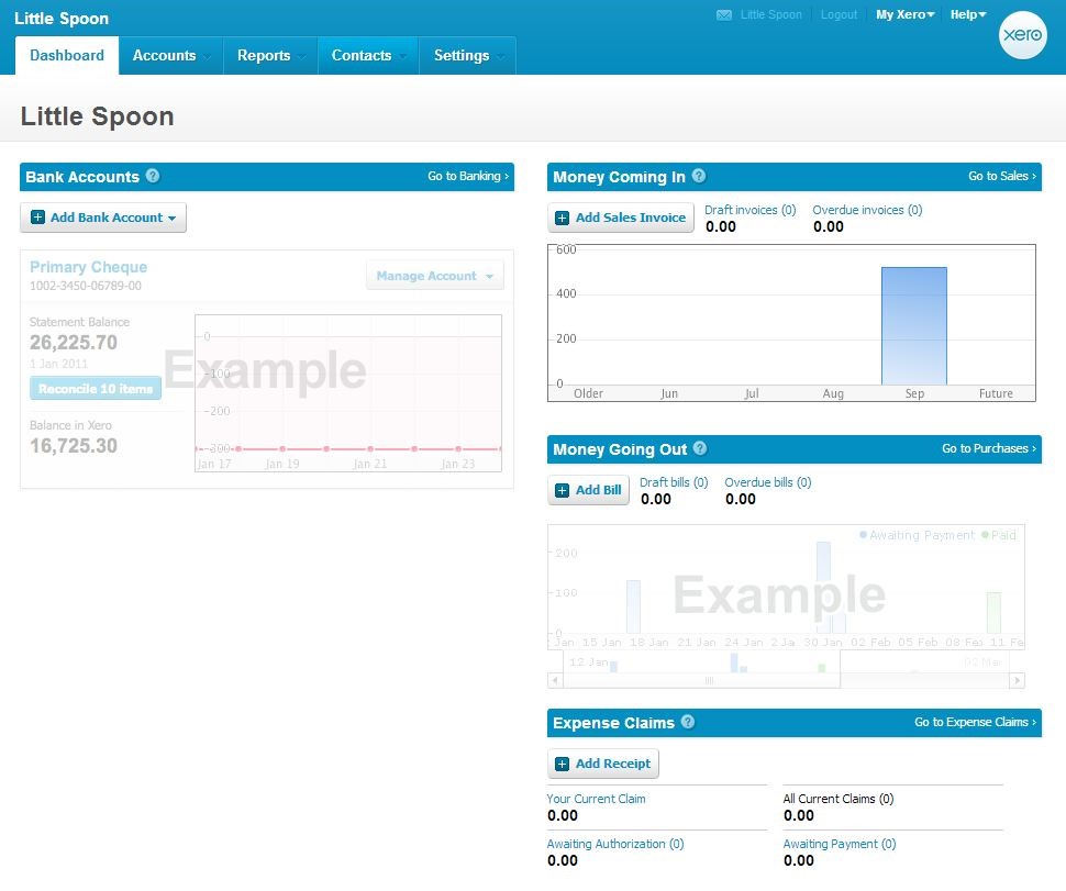
The tag line for Xero.com was “Beautiful accounting software”. True to their words, the website was a pleasant shade of blue and more importantly, Xero was organized, easy to navigate, and offering a thoughtful list of features.
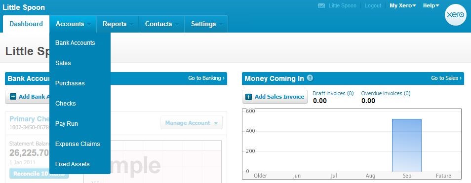
There are five main sections on xero.com: Dashboard, Accounts, Reports, Contacts, and Settings. Except for the Dashboard, all the other tabs presented users with a dropdown menu of choices to navigate inside that section. Some of the choices were static, but others were changeable based on users’ preference. This was the only website I had seen that employed this design and I liked it very much.
When users first logged on, they were greeted with the Dashboard which included information on Bank Accounts, Money Coming In, Money Going Out, and Expense Claims. I loved the straightforward approach of representing the cash flow. “Money Coming In” and “Money Going Out” were much less intimidating than Aged Invoices and Expenses and gave me a clear picture of my financial status. Bank Accounts actually included bank accounts, credit cards, and PayPal. Adding Expense claims completed the list of things a business owner needed to know in a hurry.
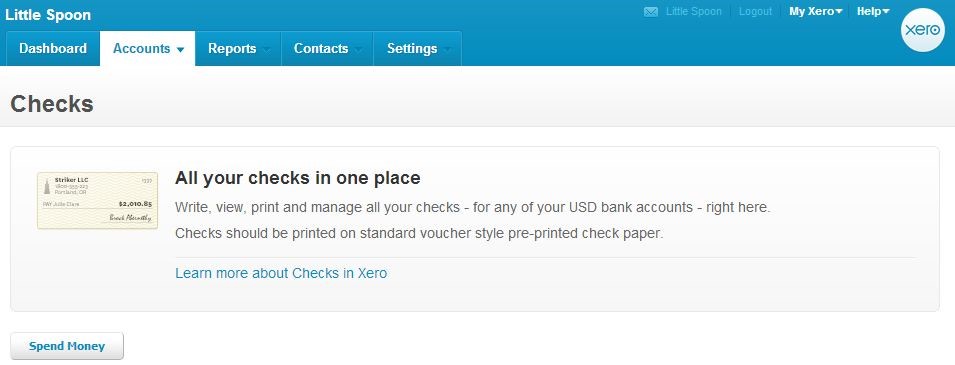
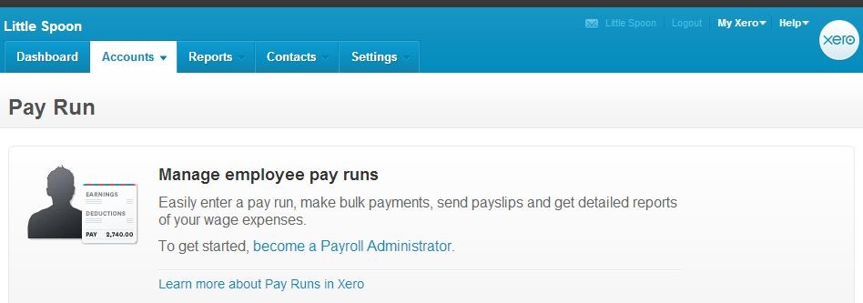
Under the “Accounts” tab, users could modify and monitor the transactions listed in the Dashboard in details. They could also import an excel spreadsheet instead of adding transactions individually. The special features that I had seen for the first time here were Checks, Pay Run, and Fixed Assets.
“Checks” allowed users to print checks from any of the bank accounts on file.
“Pay Run” was for a “Payroll Administrator”, who could either the business owner or anyone who had been authorized to access HR information.
“Fixed Assets” gave user a way to manage the assets owned by the business, including depreciation and sale.
I found the “Accounts” tab very intuitive. Template files and instructions were readily available wherever users might need them. Whenever I clicked on something, it was easy to know where I was and how to get back to where I had been. However, I wish Xero would add a about their security measures to show why I should trust the service with my banking, my credit card information, and all of my business financial information and what they would do to protect it from future hacking.
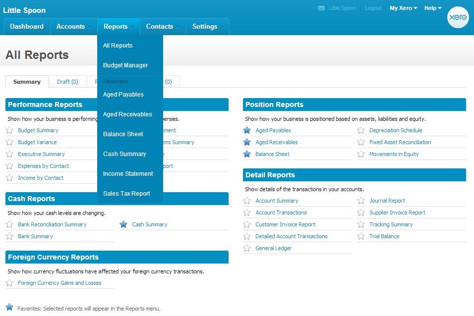
While “Dashboard” served as an overview for “Accounts”, under the “Reports” tab, “All Reports” gave users a look at all the reports that xero.com could generate on their data. This and “Budget Manager” are the only two permanent options on the Reports drop-down menu. Everything else, users could choose by starring and un-starring the reports listed on the “All Reports” page.
Xero.com both combined and separated customers and suppliers under the “Contacts” tab. One csv file could be used for importing and exporting the entire contact list. However, when users needed to see the list of just Customers or just Suppliers, they were separated in tabs as well.
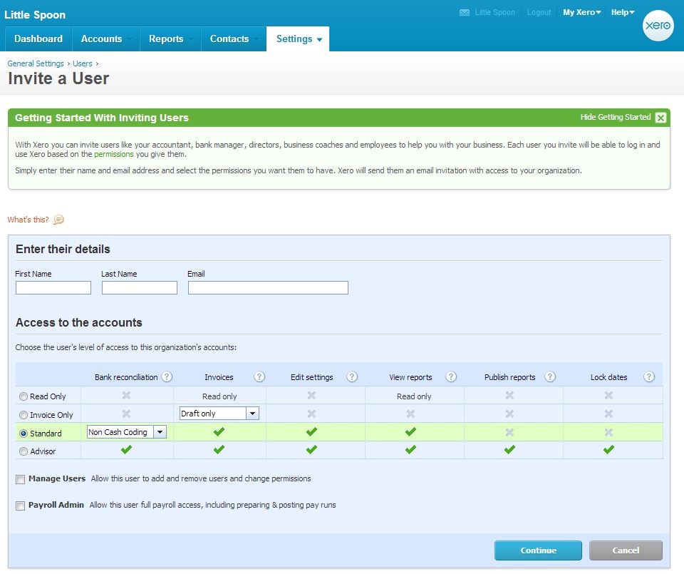
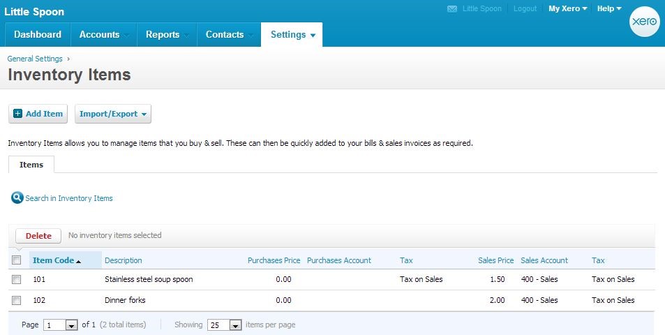
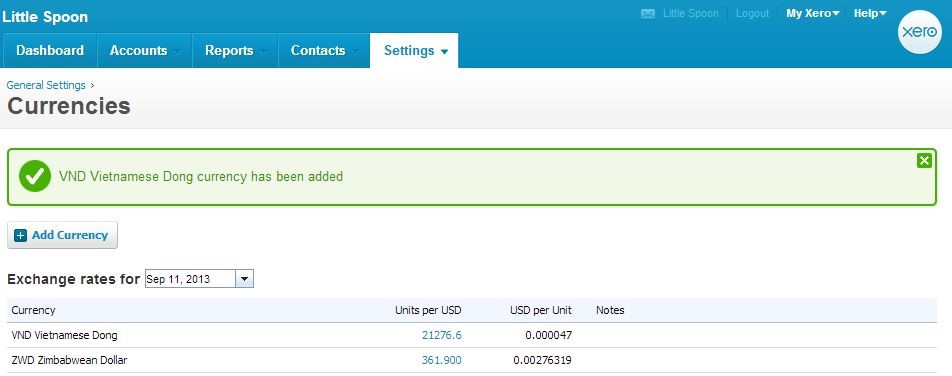
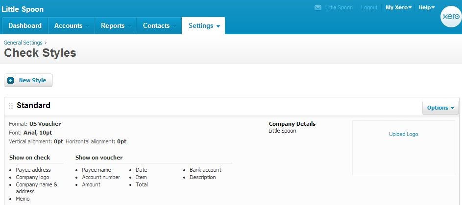
I found a treasure trove of features hiding under the “Settings” section. I could add users to my account, giving them different level of permission, or assigning them roles. I could manage my inventory. I could add multiple currencies for my transactions. I could set up a check style for all the checks I printed. Last but not least, I could set up the template and the reply-to email address for all the email corresponding sending from xero.com. While these were not required for the day to day business, they would help making it look sophisticated and established in the eyes of my business contacts.
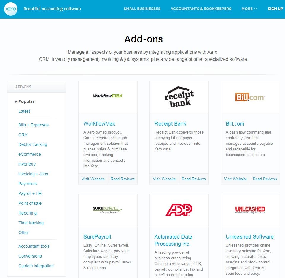
There were two choices in the Connect section of “Settings”: “Xero to Xero” was neat because it added a social aspect to using Xero, but it was Add-ons that piqued my interest. It opened up a window to other online services that could help streamlining my business. There were things that I knew like Shoeboxed and ADP, and others that I never heard of, all neatly categorized by functions.
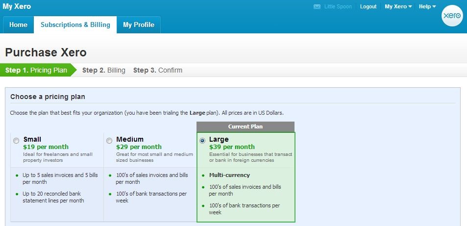
There were three tiers to Xero subscription: $19, $29, or $39/month. The lowest priced subscription was too limited that mostlikely everyone would need to go for the medium option. There was no free option at all. This was the highest monthly cost compared to other services that I looked at.
In the crowded space of online book-keeping business, xero.com stood out for thoughtful design with useful features. The functions were smartly grouped and changeable based on customers’ preferences. It was definitely on the top of my list despite the slightly higher monthly cost.
Click here if you want to give Xero a try!
